Tag Archives: graphic

RESUME Redesigned!!!

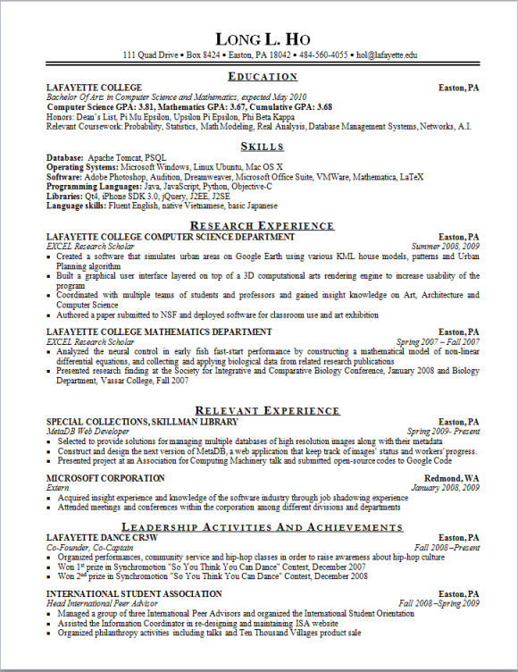
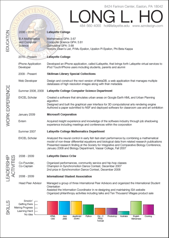
OK so since I’m redesigning my website, I might as well give my resume a new look. I’ve been learning Illustrator  and this tool is so powerful I feel like I’m using 2% of its power. Changing the look of my resume is so also pretty risky due to the conservatism in different industries. But again, this is partly to keep my creativity fresh and inspiration going. I still maintain a .doc version of my resume, more formal and less “glitzy”. So here’re the 2 versions of it:

The conservative one

The conservative one

The "cool" one

The "cool" one

I was also surprised that most web design principles seem to apply to resume design since it’s a presentation of yourself anyway. So I tried to follow these rules:

1. Large name: Yeah very very large cause it’s the most important thing in your resume. You want the recruiter to remember your name and a big font is pretty much a slap in the face (LEARN MY NAME!!!)

2. Different font: Times New Roman just wouldn’t cut it anymore, Helvetica Light will take over PERIOD. But my point is to use something other than TNR and Arial. Even Microsoft Office changed its default font to Calibri which is pretty elegant

3. Spacing: Yeah apparently I wanna give my resume some spaces to breathe. Too much text is just… too much. I also try to simplify the sentences since people have been asking me what those mean. K.I.S.S is the rule of thumb

4. Images: Text itself is boring. Your school logo with low opacity in the background will work exceptionally well. I think it looks “official” also. BTW it doesn’t have to be images, line breaks work just fine.

5. Rank your skills: Some recruiters ask you to rank yourself in the phone screen so that they can find the development team that best matches your strong skills. Well, to avoid that I’d just rank myself since my levels in those skills are not the same.

6. Efforts: Put efforts into it. It’ll look sloppy if I don’t. It’ll also show that I’m serious at presenting myself, even on a piece of paper w/o all the fancy animations.

So those are the rules I think that are pretty important. Just to throw in some bonus awesome web designer resume, here they are:

This girl uses Facebook format as her resume:

Facebook Resume

Facebook Resume

This guy uses a lot of graphs and takes full use of his Illustrator and graphic skill:

Graphical Resume

Graphical Resume

Ok so that’s it.Oh BTW I’ll be going to NSBE Conference from Wednesday to Sunday so probably I won’t be blogging till I come back. In the mean time, have fun designing!!!
Tagged , , ,

Vector and Raster graphics… what?

It’s weekend so I was kinda lazy. I’ve made a resolution to try to blog on average once a day so gotta keep it up.

Anyway, I’ve been doing some research on web design and stuff like that recently as you can see. Well when it comes to web design Photoshop is really your best friend but I’ve seen people using Illustrator and I was like what’s the deal with that? Photoshop is mad powerful in image manipulation and its not enough.

Well then I googled a bit more and found out about vector and raster graphics. I recall “layer rasterize” in Photoshop but didn’t really understand what that means until I found out about this. So what are the 2 types?

Raster graphic is pretty much any kind of image you see on your computer: jpeg, png, gif… those types are bitmap images, which are literally a map of bits. In other words, it’s like a grid of pixels and each pixel has a color (hmm you can read about Color in my previous post).

Well this kind of image is very popular and reasonable lightweight. But there’s (huge) problem: pixelation. When you zoom in those images, depending on your awesome image viewer which might perform some optimization and Anti-Aliasing, you might get a pretty good image. An example would be like this:

Anti-Aliased Zoom

Anti-Aliased Zoom

So instead of having a distorted image of checkerboard, AA tries to calculate surrounding pixel for sample colors and adjust accordingly. But it’s still UGLY. In fact I think AA came out cause most pictures are bitmaps and zooming is definitely helpful.

Now coming back to Photoshop, say you create text field with your fancy font and your fancy color and all that. Now you wanna apply some shadows and blur and those kinds of effects. You can’t do it PERIOD! Unless you rasterize it since those manipulations only work on raster images.

So what’s your text? It’s a vector image. Vector graphic is pretty a picture comprised of vectors. The file format is normally EPS. So what do you mean by vector? I mean shapes and lines. A vector is based on mathematical calculation so a diagonal line, in raster graphics means a whole bunch of pixels in certain positions having the same color, in vector graphics would mean literally a line, a bunch of points in xy-coordinate (Cartesian).

So this difference makes vector graphics very flexible to zooming since it just need to rescale the points of the vector and apply colors accordingly.

Vector and Bitmap Comparison

Vector and Bitmap Comparison

Now this makes raster graphics look bad. Yeah it does. But reality cannot be easily captured just using vector graphics. There’s been vectorization tools but so far it can only convert to a certain degree. Also gradient, shading and all those are really hard to be vectorized. As you can see the soda bottle up there doesn’t really have true gradient to it.

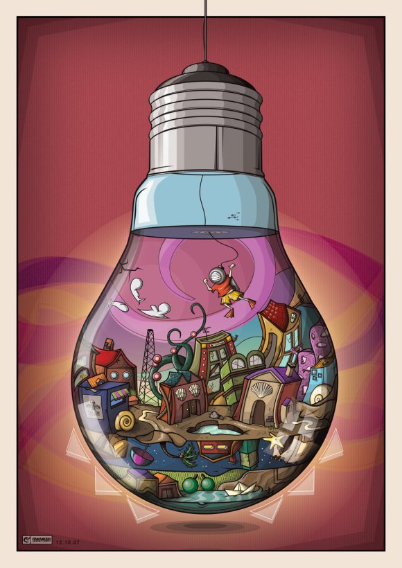
However vector graphic has developed into its own field and the images are really really mind-“blasting”. Some bonus examples:

Light Bulb Vector

Light Bulb Vector

Jessica Alba Vector

Jessica Alba Vector

Both pics cannot apply gradient properly due to the nature of region between vectors. However if you zoom out or rescale like I did, it looks pretty legit.

Ok guys have fun and keep on designing!!

Tagged , , , ,